PagBank is a Brazilian digital bank that offers a complete portfolio of financial services such as Pix transfers, QR code payments, bill payments, mobile top-ups, investments, credit and debit cards, and many other services.
With more than 21 million active users, PagBank is in several states of the country, making it one of the largest digital banks in Brazil.
The project came from the need to make the existing contact list feature available in TED transfer to Pix transfer.
After working together with the engineering and business team, we saw that there was an opportunity for improvement for the experience and for the company with the unification of flows (Pix and TED Transfer).
The proposal is for the user to have the same experience, accessing it from the Transfer menu or Pix > Transfer menu.
We defined some of the main goals we had as experience and business improvements.
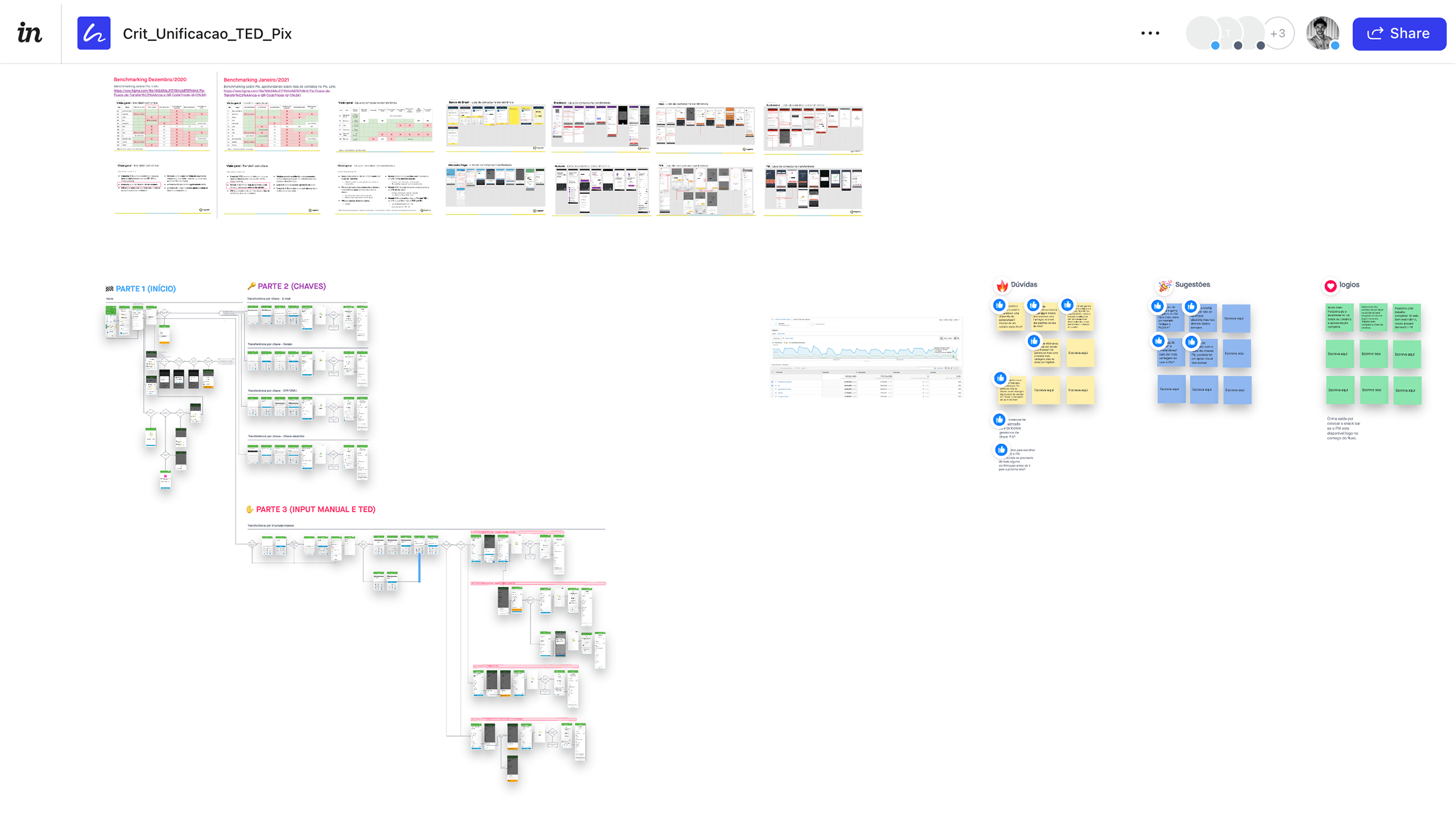
From discussions and concept analysis, we were committed to challenging our most basic assumptions about how people understand and use bank transfer services. So, the first step of the design process involved benchmarking the main banking institutions and internal research to understand how competitors and users behave. I think it’s important to get this information early in the process, before having an idea or prototyping.
It was important to understand how the big banks were making the flow of user experiences, but also to know where the opportunities for improvement were. So the benchmarks went two ways:
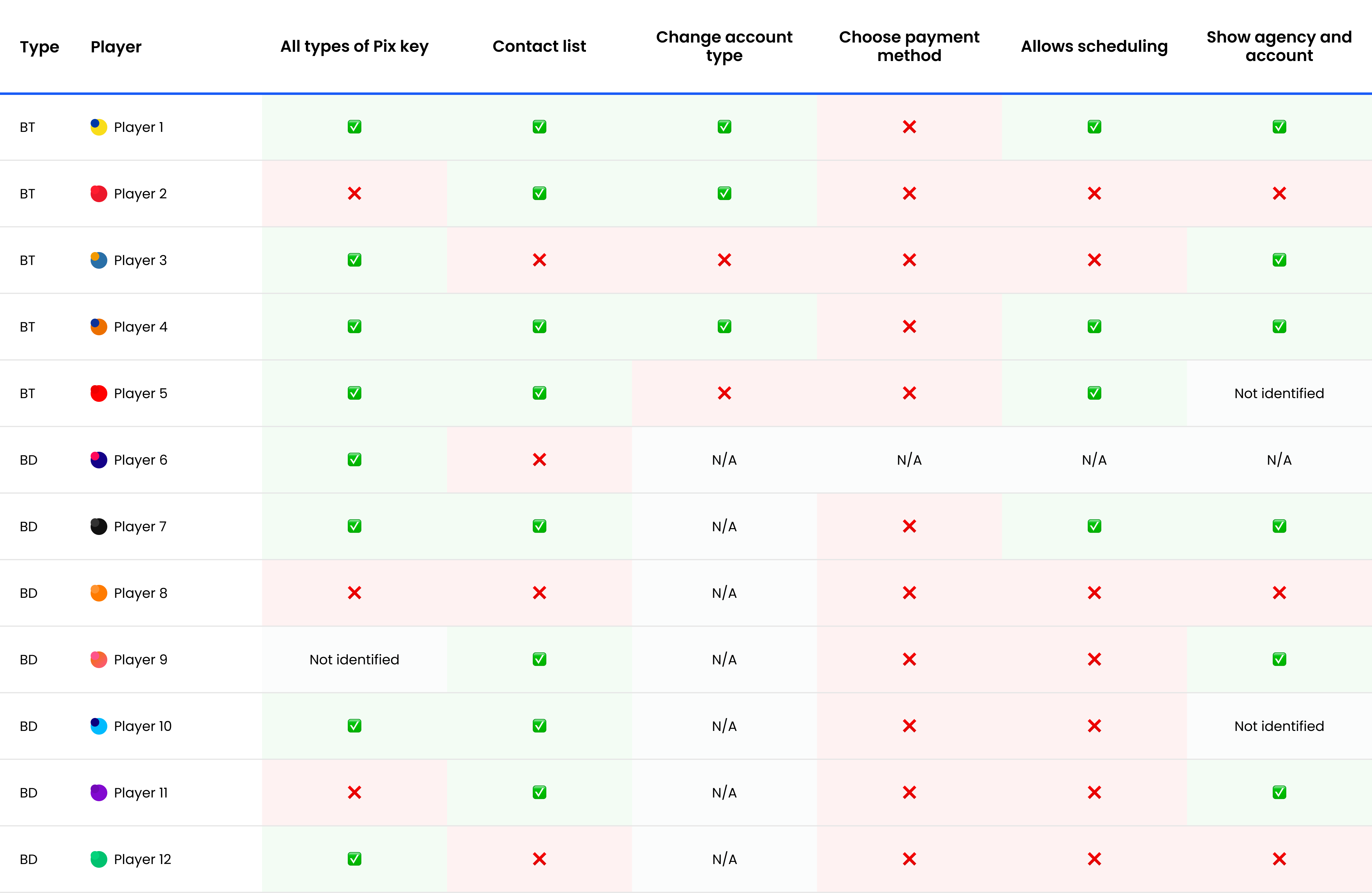
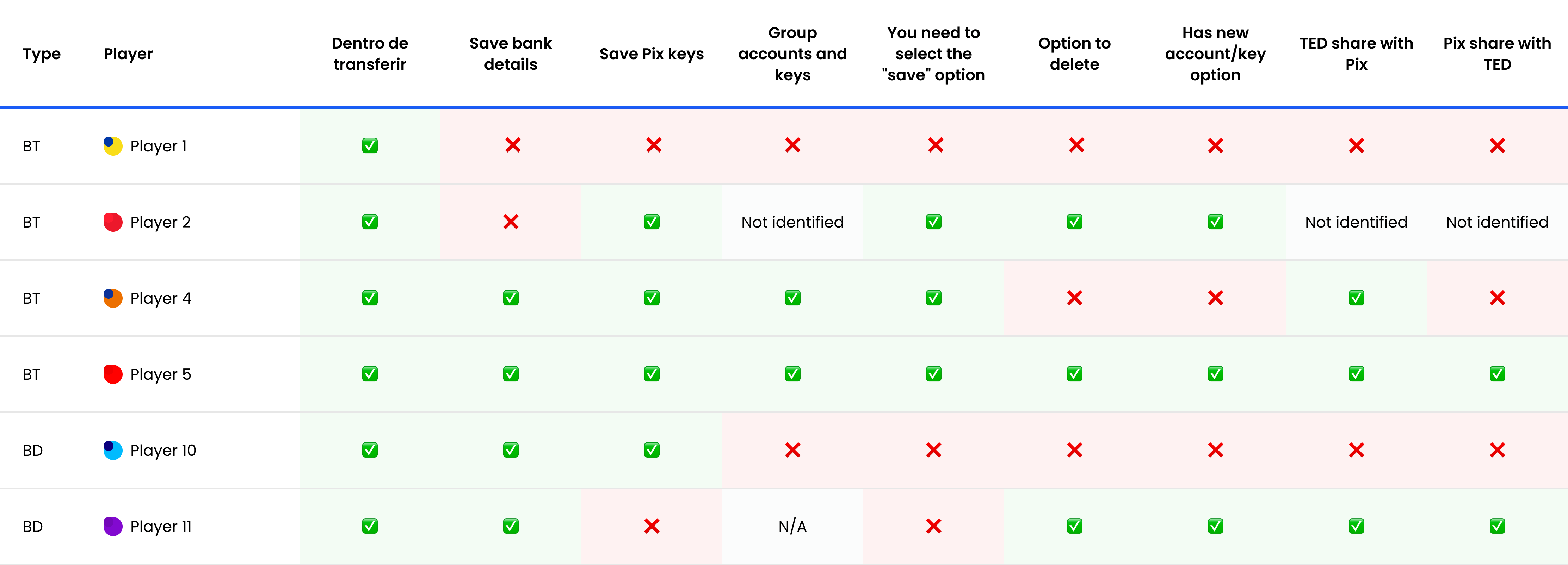
For quantitative research, we created an online survey to filter the audience for qualitative research and capture early insights. This survey was sent to our customer base to make things faster and cheaper.
Looking at internal data, we found some insights from specific user samples using TED transfer. But for the project it was also important to understand the habits and main difficulties of the user in relation to Pix, as it was a new product.
The focus of the research was to seek reports of bank transfers from Brazil. Some of the research findings were:
*Some information has been purposely omitted or altered due to its confidentiality.
Now, with the online survey responses, benchmarking analyses, and survey data, we were able to reach some conclusions to create the initial userflow proposal.
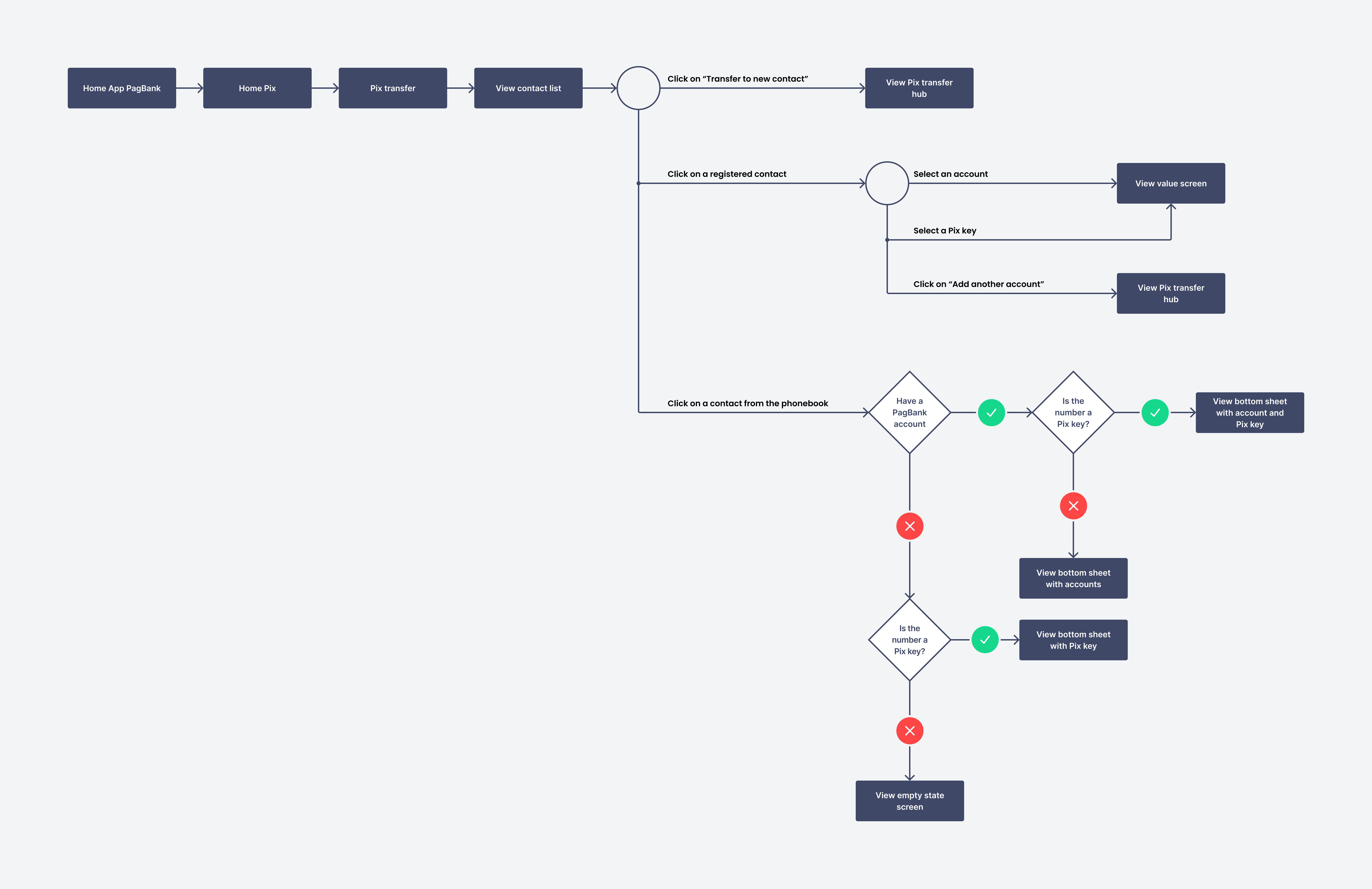
After building the user flow, we did two ideation sessions with the engineering and business team, it was an essential step to align and discuss some points:
Only after extensive discussion and brainstorming did we feel ready to start developing the wireframes and prototypes. In this step, we were able to take advantage of some screens of the current TED and Pix transfer flows.
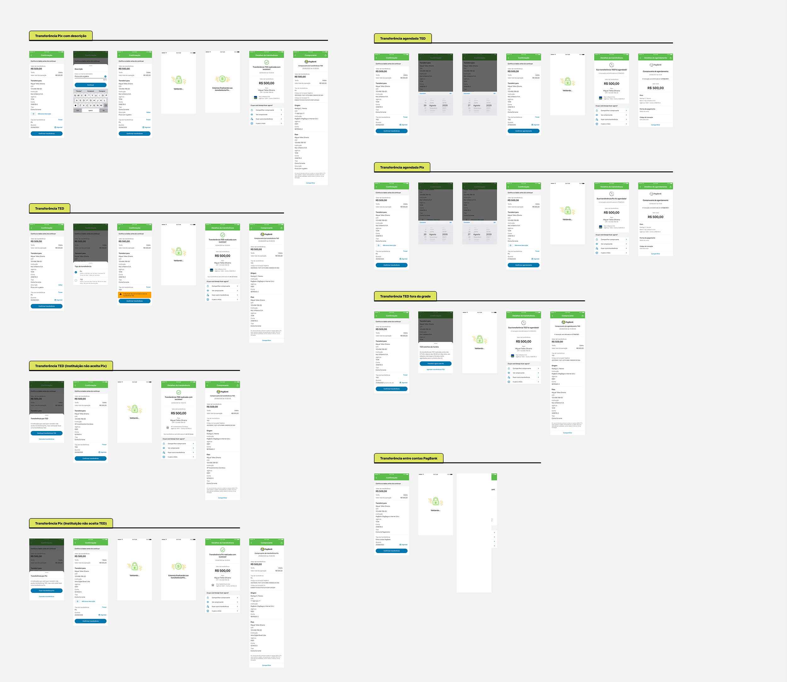
We created all the screens of all the foreseen scenarios, transfer by Pix key, transfer by agency and account for institution that accepts TED and Pix, for institution that only accepts Pix, for institution that only accepts TED, between PagBank accounts, scheduled transfer, exception scenarios, empty states, communication ruler, and many others (there were so many scenarios 😦).
We allowed ourselves to go crazy in the beginning, to build and predict as many scenarios as possible, both the ones that were found by the engineering team in the ideation and the ones we hadn’t foreseen yet.
After mapping all the scenarios, I went into refinement mode, creating more fidelity prototypes, considering design principles such as contrast, hierarchy, brand attributes, and following the design system recommendations. The prototypes were created for both iOS and Android devices.

After finishing building the high-fidelity prototypes, I did a Design Crit with the designers of the digital account to get some feedback and identify if there were any experience gaps. Validation, while part of my usual design process, Design Crit is a post-conceptualization and interface step, and is not discussed in depth in this case.
User usability testing is a central method of user experience. That’s why we chose to approach 7 people, considering the recommendation of Donald Norman’s article, “Why you only need to test with 5 users”, noting that it is possible to learn about 80% of the errors, problems and behavior of the first 5 users .
As we are in a typical pandemic moment, the tests were carried out remotely with Lookback and Google Meet, with navigable prototypes for users to perform 5 tasks in order to collect feedback and validate hypotheses.
The interview sample considered men and women aged 21 to 60 years, from 5 Brazilian states, and with different habits.
Usability testing lasted about 40 minutes and included topics to get to the point of what users are trying to do and what their issues are. So the goals were:
After analyzing the usability tests, we were able to validate our hypotheses and reach satisfactory results.
But we believe that this delivery didn’t end here, analysis of metrics such as transfer usage by TED or Pix, usage of the contact list, comparison of transfers performed by agency and account in relation to Pix keys, and other metrics to be analyzed when the product is available to all users of the PagBank app.


Because it is a large delivery, we made the decision together with the engineering team to carry out deliveries in stages. In the first two months after the partial implementation, we were able to get a lot of good results that we had as goals.