PagBank is one of Brazil’s largest digital banks, with over 20 million active users. It offers a complete financial ecosystem for both individuals and businesses, including digital accounts, cards, investments, payment solutions, and Pix, the country’s real-time payment system.
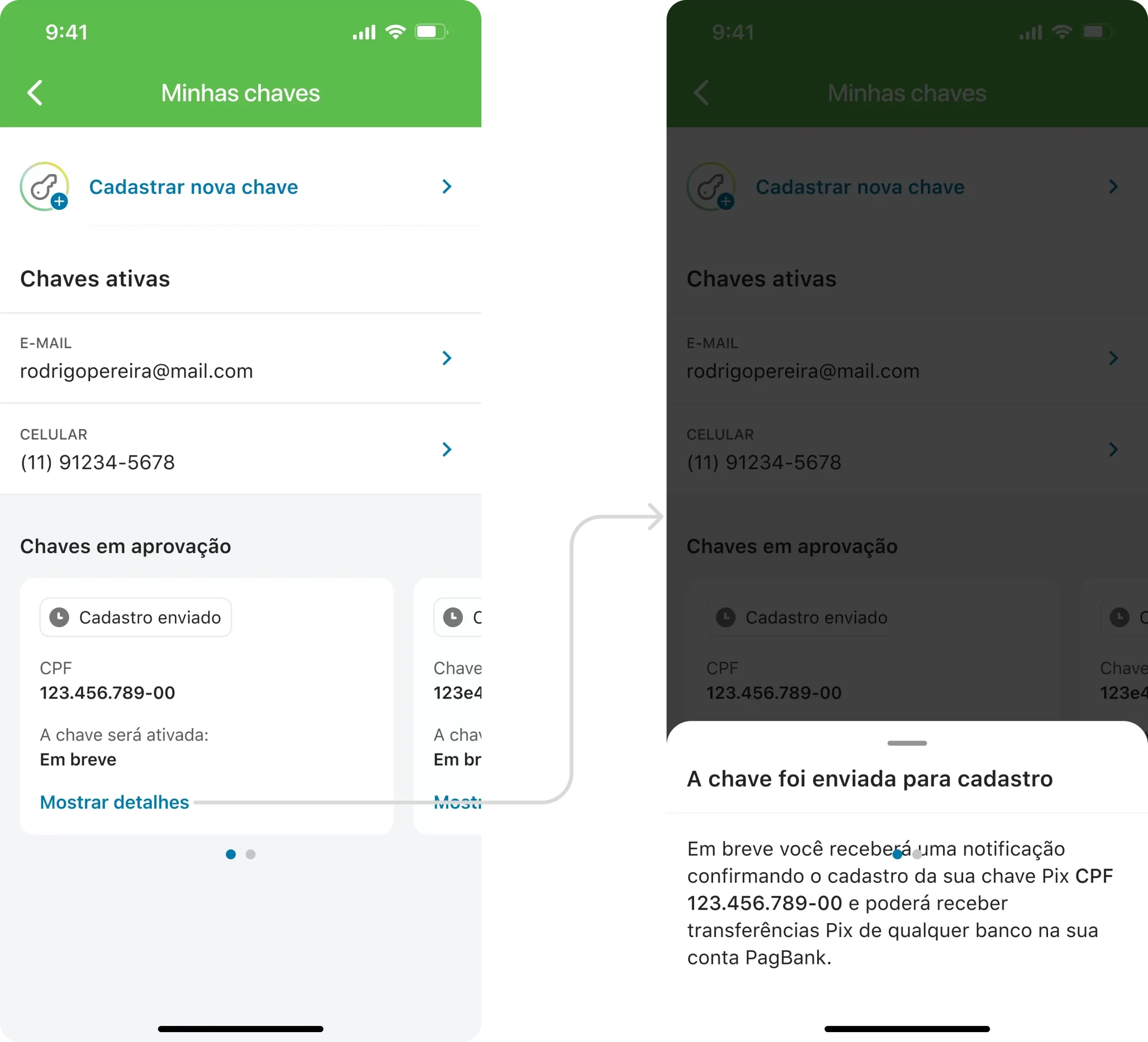
Pix has quickly become an essential part of Brazilians’ daily financial lives. At PagBank, during the development of non-registered Pix key support (allowing users to register an email or phone number not linked to their account), we saw an opportunity to enhance the entire experience of registering and managing Pix keys. Based on insights from competitive benchmarking and Google Analytics data, we decided to redesign the entire flow to make it more intuitive and efficient.
I led the end-to-end design process, from initial research and benchmarking to delivering high-fidelity designs and documentation.
My work included analyzing Pix key metrics, mapping user journeys, facilitating ideation and co-creation workshops with Product and Engineering, creating wireframes and interactive prototypes (using InVision for testing), running usability tests (quantitative via Maze and qualitative via moderated sessions), and iterating based on feedback and user data.
I also played an active role in design critique sessions to ensure the final solution was both high-quality and consistency.
Our goal was to improve the Pix key management experience with a focus on:
We followed a user-centered design approach, broken into four main stages:
We started with an investigation of the current scenario. Through competitive benchmarking with 11 different financial institutions (including both traditional and digital banks), we analyzed usage data from Google Analytics, gathered insights from customer support teams, and revisited findings from previous accessibility research.
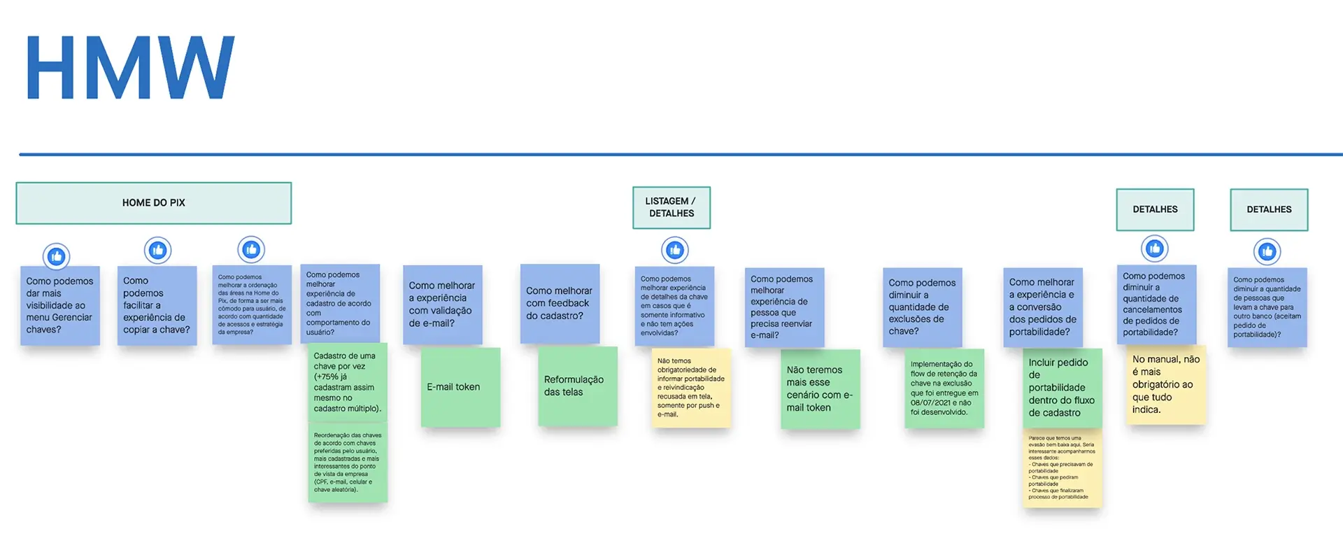
Using the “How Might We” framework, we translated those insights into design opportunities and actionable questions.
Based on the identified opportunities, we ran ideation sessions with stakeholders from Product and Engineering. We explored various approaches and narrowed down the concepts into two main flows using wireframes. These proposals were internally reviewed through design critiques and stakeholder check-ins before we aligned on the final direction.
To validate hypotheses and the proposed design, we employed two research methods:
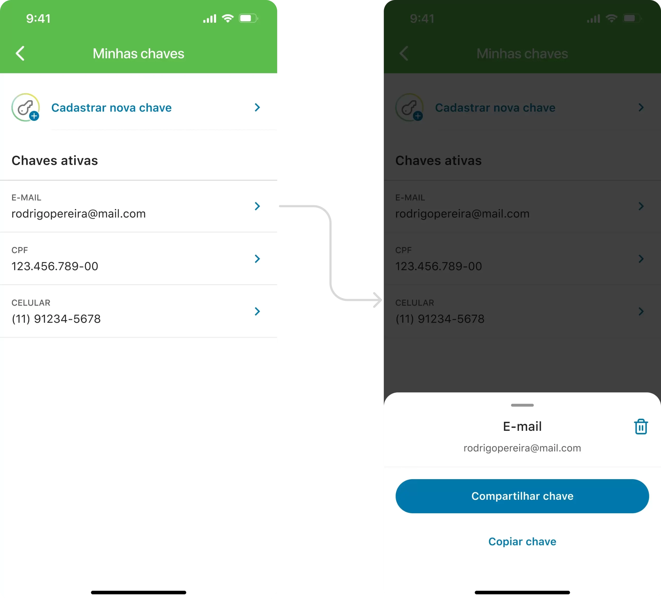
We analyzed both the quantitative data (task success, click paths) and qualitative insights (user quotes, observed behaviors). Portability emerged as the most complex and misunderstood feature. We refined the flow and components related to portability and key details by simplifying screens, rewriting labels, and restructuring the information architecture—introducing contextual bottom sheets, for example.
After a final design critique session, we delivered documented specs to the development team, ensuring consistency across iOS and Android.
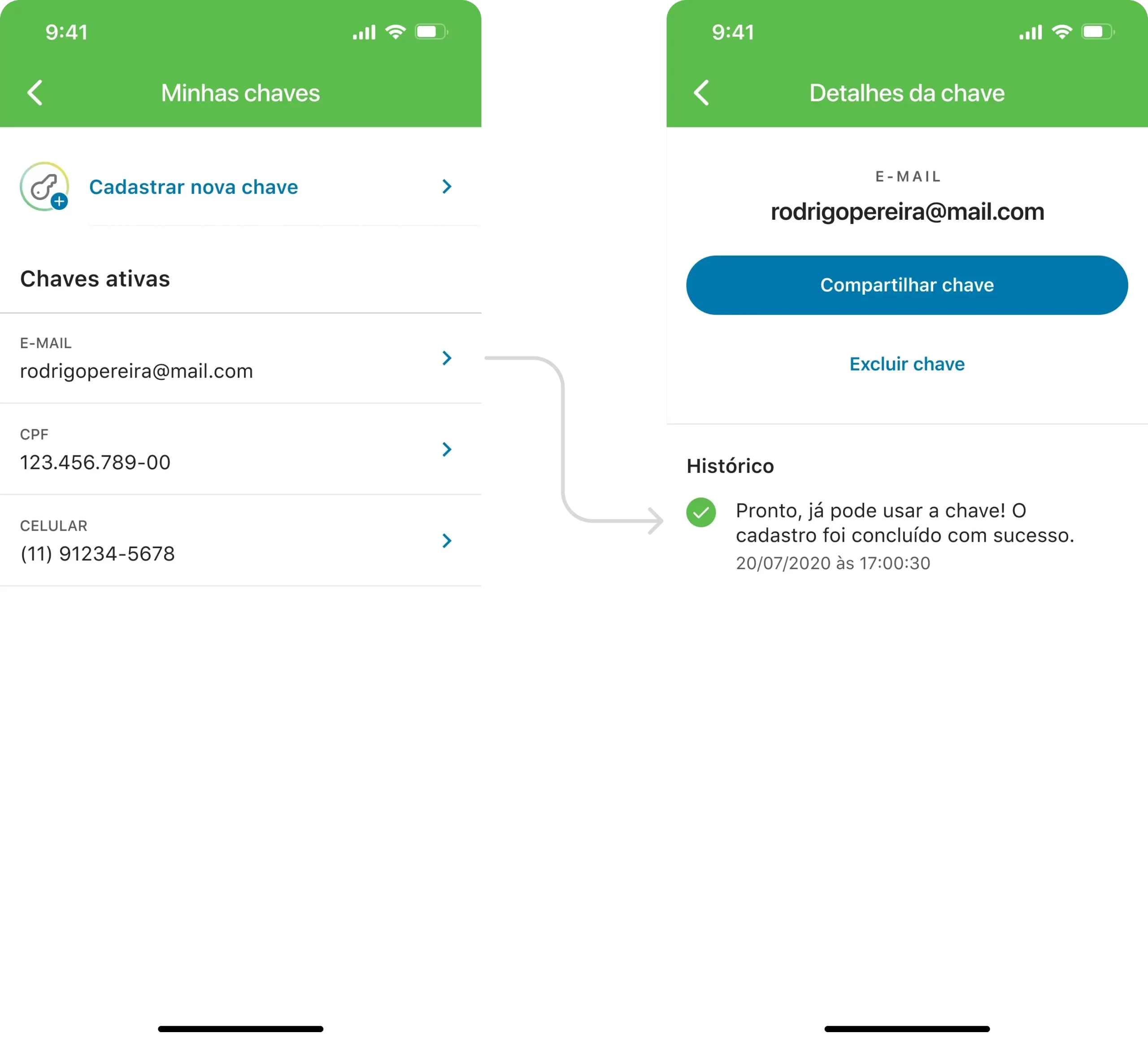
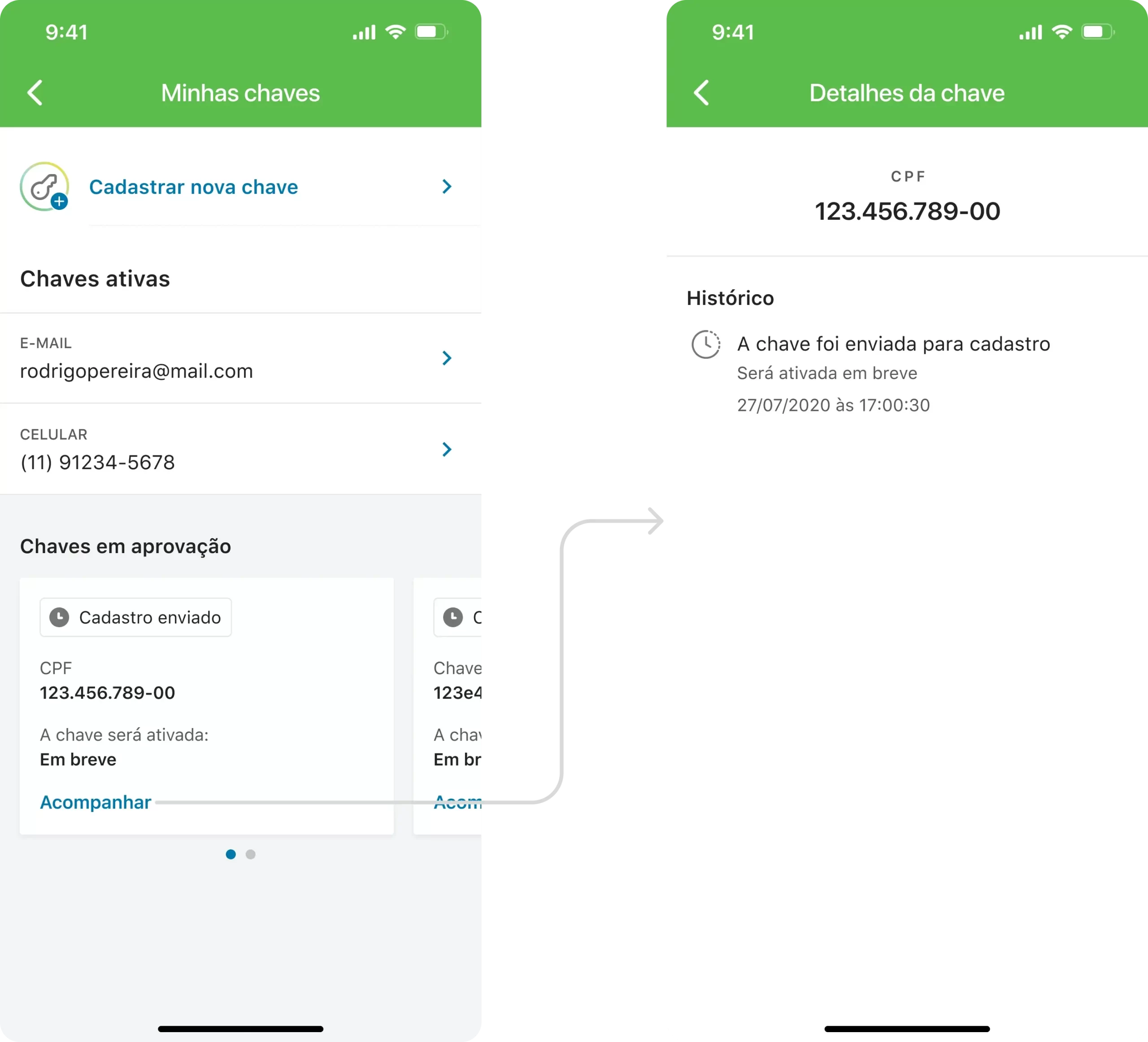
Based on our research and objectives, we delivered several key improvements:
The changes delivered clear, measurable impact in the first 3 months post-launch: